How to interpret a weather chart
by Kirsty McCabe, FRMetS
Ever looked at a synoptic or pressure chart and felt a bit lost? They can seem a bit daunting at first, what with all the different coloured lines, semicircles and triangles, but they are actually quite simple to interpret. And once you’ve got the hang of them, you’ll be able to tell at a glance what our weather is up to.
The word ‘synoptic’ simply means a summary of the current situation, so in weather terms, a synoptic or pressure chart is a map that summarises the atmospheric conditions over a wide area at a given time.
Where are you?
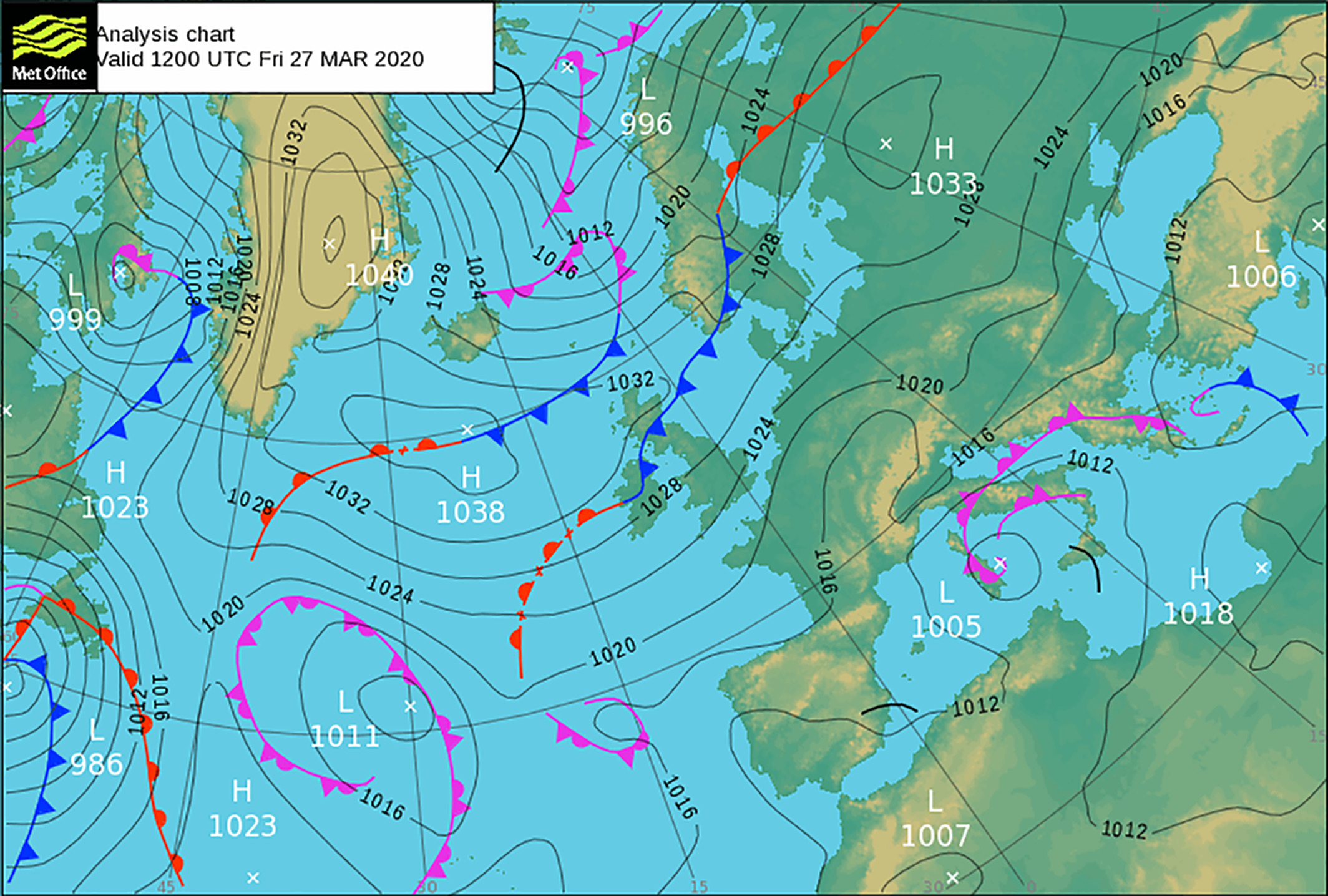
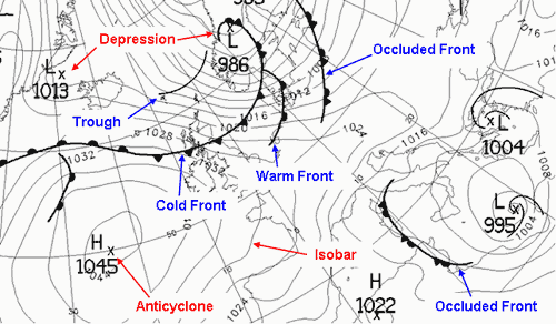
The first thing you need to find on a pressure chart is the land – usually, the UK is located fairly centrally, with Iceland and Greenland to the top left and continental Europe to the right. The projection might seem a little bit odd, but having north, where the lines of longitude converge, in the top left corner means we can see as much as possible of the relevant area around the UK.
![]()
Next, let’s take a look at the black lines or isobars, which join areas of equal atmospheric pressure. These are important as they reveal where the wind is coming from and how strong it is. They often form circular shapes -- areas of high or low pressure. Look out for an H or L with a number next to it to see whether it’s a high or a low. In the UK, the average sea-level pressure is about 1013 mb, and it is rare for pressure to rise above 1050 mb or fall below 950 mb.
Which way the wind blows
The easiest thing to spot is how strong the wind will be. The closer together the black lines or isobars are, then the windier it is. There is a slight caveat here in that the speed varies with latitude, but on the scale of the UK, it doesn’t matter too much.
Wind blows almost parallel to the isobars, and in order to tell which way the wind is blowing, we use Buys Ballot’s Law. Basically, if you stand with your back to the wind, pressure is lower to the left than the right (in the northern hemisphere). Wind directions refer to the direction the wind is coming from, so a westerly wind will blow from the west to the east.
High and dry
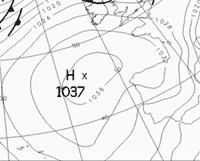
Winds blow clockwise around an anticyclone or area of high pressure. These can be found by looking for a big number, like 1020mb in the centre of a loose circle on a weather chart. With descending air (hence high pressure), cloud formation is limited. High pressure in the British summertime often brings fine, warm weather and light winds. Even ridging in the isobars means more settled conditions.
Swing low
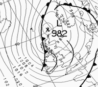
The dartboards of a weather chart are cyclones or areas of low pressure with isobars drawn in tightly packed circles. Here the winds move in an anticlockwise direction, and air is rising. As it rises and cools, water vapour condenses to form clouds and rain. Known to bring unsettled, wet and windy weather, these depressions are aptly named and usually have low numbers around 980mb.
As well as isobars, the other lines to look out for on pressure charts are weather fronts, which represent the boundary between different air masses, and bodies of air with uniform temperature and humidity profiles that bring distinctive weather features to the UK.
Frontal battleground
The boundary between two air masses is where the interesting weather happens. The concept of weather fronts first appeared in 1919 when Norwegian meteorologist Wilhelm Bjerknes identified that this transition zone was like a battleground between two opposing air masses and termed it a front.
In our latitudes a front usually separates warm, moist tropical air from cold, dry polar air. Whether it’s a cold or a warm front depends on which air mass is winning the battle. Bjerknes called the boundary between a warm air mass and an advancing cold air mass a cold front, and likewise the boundary between a cold air mass and an advancing warm air mass a warm front. Fronts move with the wind so with our prevailing westerlies they usually travel from west to east with cold fronts moving faster than warm fronts.
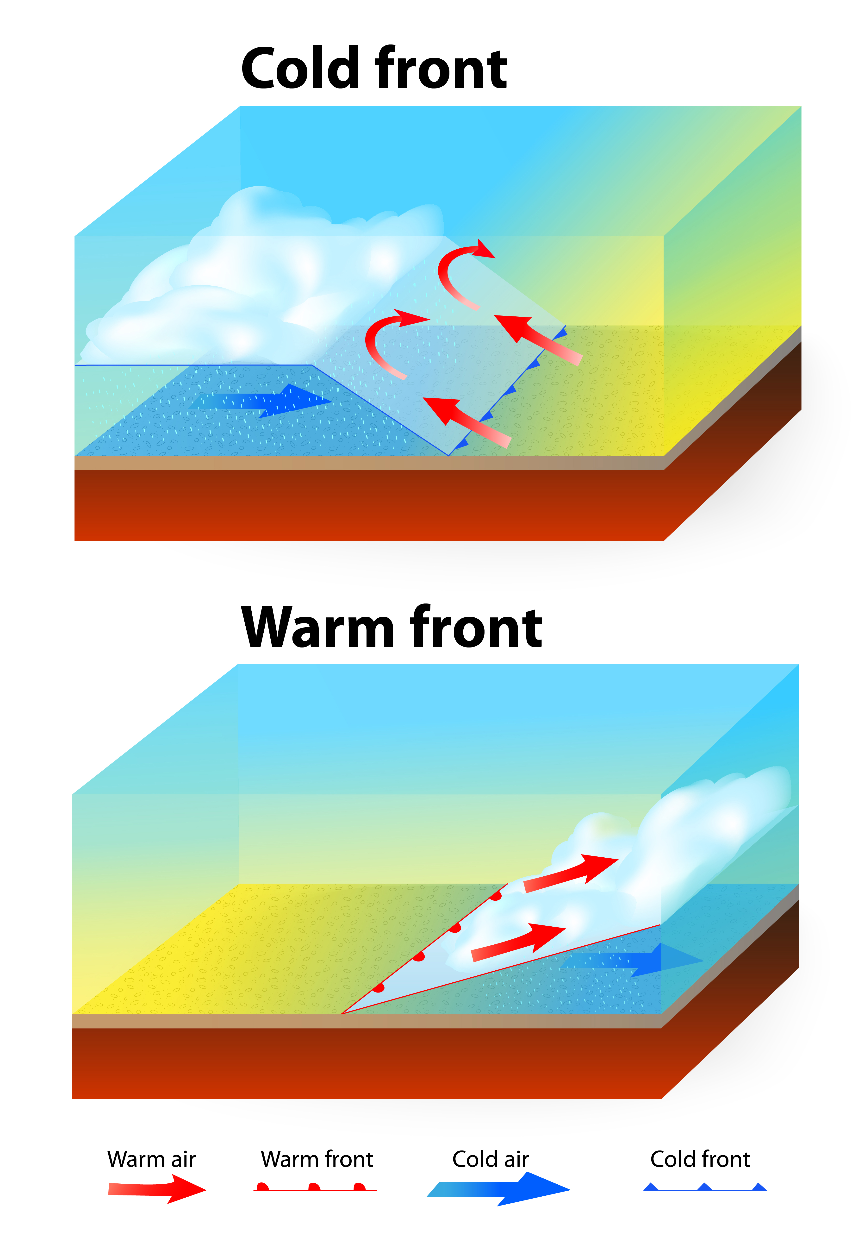
Heat is on
![]()
A warm front is usually coloured red with semicircles pointing in the direction of travel. The semicircles were picked to resemble a rising sun bringing warmth. Ahead of an approaching warm front the cloud thickens and it starts to rain. The rain band will extend up to 200 miles ahead of the front, and while not as heavy as that of a cold front the rain lasts longer. In fact, the weather often remains grey and drizzly even after the front has passed. This is due to “warm sector” conditions between the warm front and a cold front. The actual passage of the front is marked by the wind changing in a clockwise direction.
![]()
A cold front brings colder air, so the line representing it on a weather map is often coloured blue with triangles on it, to remind us of icicles. These triangles point in the direction of travel of the front. Cold fronts bring a fairly narrow band of rain, sometimes heavy and possibly thundery, followed by clearer cooler spells and showers. Again, as the front passes the wind veers – changes in a clockwise direction, from southerly to westerly for example.
Even on a black and white chart, the triangles and semicircles are enough to tell you what kind of front you’re looking at.
Blowing hot and cold
![]()
Then there’s the purple lines with both triangles and semicircles? This is known as an occluded front, which is what happens when a cold front catches up with a warm front, forcing the warm air aloft. Consequently, the weather ahead of the occlusion is like that ahead of a warm front whereas behind the occlusion will be similar to behind that of a cold front.
Sometimes the red, blue or purple line of a front will be broken by crosses. This indicates that the front is weakening and there will be less of a difference between the cold and warm air, and less rain is likely as well.
![]()
And finally, we have troughs – black lines with no semicircles or triangles (that aren’t isobars). These mark areas where the air is particularly unstable and indicates showers are likely.
During the winter months, fans of snow will often scrutinise synoptic pressure charts for something called the ‘528 line’. This MetMatters post explains more about the thickness of the atmosphere and why the 528 line often heralds wintry weather.
So the next time you see a synoptic weather chart, you’ll be able to look for areas of high (anticyclone) or low pressure (depression), check out the wind speed and direction and find out whether it’s a warm or a cold front heading our way. More importantly, you’ll have a good idea of what weather to expect.
Images reproduced with the kind permission of the Met Office.